Nature By Design

Why Nature’s Palette Is the Original Masterclass in Color
When it comes to color, Mother Nature doesn’t just know what she’s doing, she’s been the original color theorist since the beginning of time.
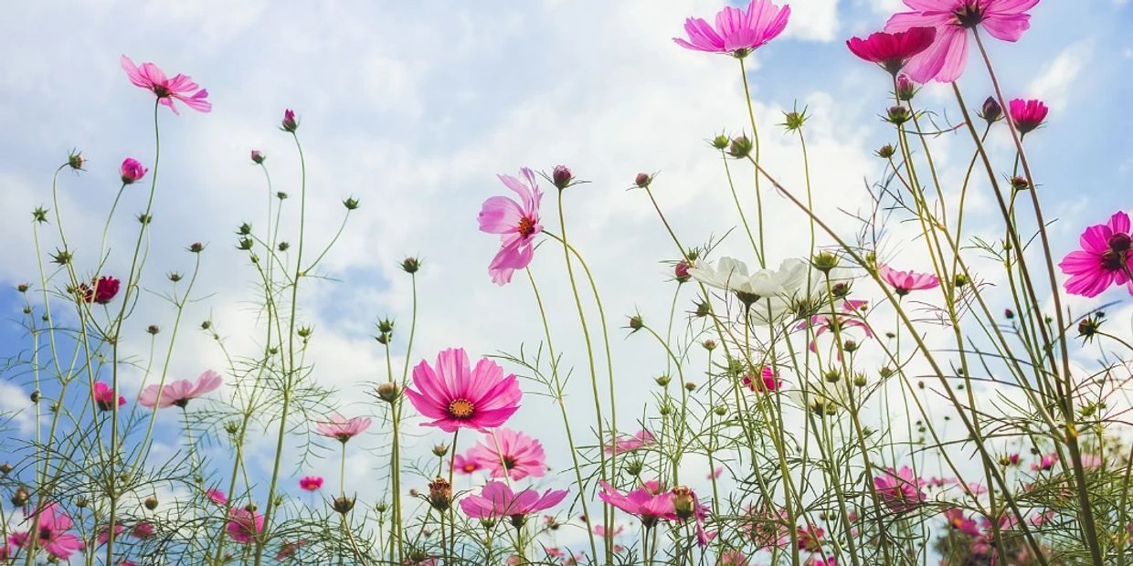
From the shifting hues of a sunrise to the matte, muted tones of desert rock; from the iridescent shimmer on a butterfly’s wing to the perfect ombré of fall leaves, nature is full of palettes that are both breathtakingly beautiful and emotionally nourishing.
Nature’s color combinations never feel forced, clashing, or jarring and that’s not by accident. Our brains are biologically wired to respond to these hues with a sense of calm, connection, and clarity.
What Makes Nature’s Colors So Powerful?
- They’re balanced.
Nature naturally pairs complementary undertones: soft mossy greens next to warm earth tones, or bright petals offset by cool leaves. - They’re emotionally intelligent.
The colors of the natural world evoke powerful psychological responses: green reduces stress, blue slows our breathing, and golden sunlight boosts serotonin. - They evolve with light.
Colors in nature shift constantly, from golden hour to overcast skies, reminding us that fluidity in color is not only acceptable, but beautiful.
When in Doubt, Go Outside
Ah yes. Timeless.
Everyone’s chasing it like it’s some magical design unicorn. But let’s be real. Timeless is completely subjective.
Technically, it means you can’t tell what decade something was installed. Think classic subway tile or penny rounds. But personally, I think timeless is whatever you’ve always loved and will always love. What better way to figure that out than by asking where in nature you feel most like yourself?
So when someone tells me they don’t know what they want, I ask them to close their eyes.
Then I say, “Where in nature do you feel your best? Where do you breathe the easiest? What place makes the rest of the world fade out a little?”
And when they tell me, I say, “Perfect. That’s our palette.”
Because that place you love, that feeling you get just being there...it doesn’t change.
It’s not a trend. It’s truth. And when we pull colors from that place, you end up with a space that doesn’t just look good, it feels like home.
One of my clients once told me about her favorite place in the world. She was driving up to Mt. Hood in the winter, right after a fresh snowfall. Everything was quiet and still. Just white snow blanketing the trees, deep green evergreens peeking through, and these earthy brown trunks grounding it all. She said it’s the one place she feels like she can actually breathe.
So we pulled her palette from that. Cool whites, soft greens, warm wood tones. Nothing trendy, just the colors of where she feels most at peace.
And now? She still texts me every so often to say how happy she feels walking in the door. Like her house is giving her a big exhale. That’s the goal. That’s the kind of design that sticks with people. The kind that feels like home in your bones.
That’s the kind of design that matters. We’re not just making things pretty. We’re helping people feel good. And that? That’s something special. That’s why this work is so worth it.

Nature Palettes
This website uses cookies.
We use cookies to analyze website traffic and optimize your website experience. By accepting our use of cookies, your data will be aggregated with all other user data.